January 2021
Waterworks
16/01/21 15:33
I like to use a palette knife to work on paintings and one day by mistake I didn’t dry it off after I had cleaned it with water. When I brought it to my painting it dripped water on the painting and I was disappointed that I’d let that mistake happen. But as I looked at the painting I saw that the water begin to interact with the paint around it and before long it had begun to do something I’d never seen before. It was intriguing. It looked like a delta at the end of a river. Here is a similar effect, enhanced by blacklight:
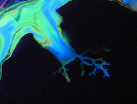
The water dripped onto the colored portion and thinned the paint. The black background was already wet black paint and the water spread out over it carrying the thinned colors along with it. I found that it worked better with dark colors of light ones, but that the effect was difficult to control and didn’t always even happen. I tried the same approach in many locations but it might only form a delta shape in one of them.
I wanted to understand more. I tried a bunch of different liquids aside from water: alcohol, dish soap, silicon oil, mineral oil, and hydrogen peroxide. The hydrogen peroxide worked like water and nothing else did. The others form cells, but the water does something different.
I started experimenting with water and with watery paint. I found that pure water on a painting can be interesting but once you begin to apply water you can no longer tilt the painting and use gravity to pull paint around. This tends to push steps involving water or watery paint toward the end of the process for a given painting.
The problems with water were that if too much was used it could cause the paints to blend or it might flow underneath the paint where it doesn’t have as much of a visual effect. It does have an effect, but if it doesn’t change what the painting looks like very much it isn’t that interesting to me.
In the photo below all the paints were mixed 50/50 with water and the background Prussian blue over a bunch of colors distributed around the canvas. Water was dripped on the canvas from various heights (with no paint in the water). The height diminishes from left to right, from about 3’ to about 1/2”.

C) The water drips in this area and the area above it were dropped from about three feet.
D) The water drips in this region were dropped from about two feet.
E) The water drips in this region were dropped from about one foot.
F) The water drips in this region were dropped from less than an inch.
What I found was much more interesting was thinned paint, used as water. I experimented with lots of different concentrations of thinned paint. I finally settled on a 50/50 mix of prepared pouring paint and water. I use a recipe of 1 part Liquitex Basics Acrylic Paint, 1.5 parts white glue and 1 part water when I mix my paints. The result is something very like water but with enough color to be seen on your painting.
Here is a practice canvas covered initially with iridescent white. I dripped thinned paint of various concentrations on it from various heights.

K) The yellow was thinned too much. I tried a 10:1 mix of water to mixed paint and it disappeared into the background. Perhaps a darker color would work better but even the darker colors faded out at lower concentrations. They look better when wet than when they dry when the concentration of paint is low.
L) this is a drip of red, thinned paint that was dropped from very close to the canvas. I was hoping it would form a delta, and it has the beginnings of that, but most of the thinned paint slipped beneath the background white color. You can see lots of other dots that have slipped below the surface and not interacted with the paint around them.
M) This one was dropped from about a yard above the painting. When it hit the paint exploded and you can see lines and dots of paint around it where small bits of paint went flying. Some slipped below but because there was so much force when it landed, it didn’t have a smooth edge. The smooth edge is an impediment to forming details like a delta. Where will the effect begin? No one spot is favored over any other and nothing breaks the tie. Whereas, with the chaos of exploding on the canvas there are lots of differences along the edges and some of the paint flows out and some doesn’t.
N) Smaller amounts of paint dropped from heigh enough record an impression of their explosive pattern. If the paint ends up thin enough it dries fairly quickly and that halts any kind of evolution involving the water.
O) Larger amounts of water, such as consecutive drops in the same place can interact and support each other.
P) When there is too much water the paint can blend (as if you were mixing colors). If the canvas isn’t completely flat too much water will find an edge and carry paint with it.
I put it all together and began working with larger amounts of paint dropped from high positions. Here’s a portion of a canvas where I dropped lots of dark purple paint drops in about the same area and let them all interact. I also dropped lighter purple drops of paint, but less of them overall. It may also have been that the light green background had begun to dry by the time the lighter purple drops were applied.

A) This area shows what I think was a single drop of purple paint from among a bunch of drops of paint that fill the upper-left portion of this image. They formed deltas all around them. I made more of the purple paint so its mixture was probably closest to 50/50.
B) The lighter purple drops yielded poor results. Either the canvas was too dry, or the concentration was off, or there was too little water. The area with B and the just to the upper left of it are among the best results with that color, but lots more dots did nothing at all. To be fair, the light green background was a thin coating on the canvas and not a thick coating of paint. I did experiment separately with dropping thinned paint onto a painting with a thicker coat of paint, and the drops slid under the paint and mostly disappeared.

The water dripped onto the colored portion and thinned the paint. The black background was already wet black paint and the water spread out over it carrying the thinned colors along with it. I found that it worked better with dark colors of light ones, but that the effect was difficult to control and didn’t always even happen. I tried the same approach in many locations but it might only form a delta shape in one of them.
I wanted to understand more. I tried a bunch of different liquids aside from water: alcohol, dish soap, silicon oil, mineral oil, and hydrogen peroxide. The hydrogen peroxide worked like water and nothing else did. The others form cells, but the water does something different.
I started experimenting with water and with watery paint. I found that pure water on a painting can be interesting but once you begin to apply water you can no longer tilt the painting and use gravity to pull paint around. This tends to push steps involving water or watery paint toward the end of the process for a given painting.
The problems with water were that if too much was used it could cause the paints to blend or it might flow underneath the paint where it doesn’t have as much of a visual effect. It does have an effect, but if it doesn’t change what the painting looks like very much it isn’t that interesting to me.
In the photo below all the paints were mixed 50/50 with water and the background Prussian blue over a bunch of colors distributed around the canvas. Water was dripped on the canvas from various heights (with no paint in the water). The height diminishes from left to right, from about 3’ to about 1/2”.


C) The water drips in this area and the area above it were dropped from about three feet.
D) The water drips in this region were dropped from about two feet.
E) The water drips in this region were dropped from about one foot.
F) The water drips in this region were dropped from less than an inch.
What I found was much more interesting was thinned paint, used as water. I experimented with lots of different concentrations of thinned paint. I finally settled on a 50/50 mix of prepared pouring paint and water. I use a recipe of 1 part Liquitex Basics Acrylic Paint, 1.5 parts white glue and 1 part water when I mix my paints. The result is something very like water but with enough color to be seen on your painting.
Here is a practice canvas covered initially with iridescent white. I dripped thinned paint of various concentrations on it from various heights.


K) The yellow was thinned too much. I tried a 10:1 mix of water to mixed paint and it disappeared into the background. Perhaps a darker color would work better but even the darker colors faded out at lower concentrations. They look better when wet than when they dry when the concentration of paint is low.
L) this is a drip of red, thinned paint that was dropped from very close to the canvas. I was hoping it would form a delta, and it has the beginnings of that, but most of the thinned paint slipped beneath the background white color. You can see lots of other dots that have slipped below the surface and not interacted with the paint around them.
M) This one was dropped from about a yard above the painting. When it hit the paint exploded and you can see lines and dots of paint around it where small bits of paint went flying. Some slipped below but because there was so much force when it landed, it didn’t have a smooth edge. The smooth edge is an impediment to forming details like a delta. Where will the effect begin? No one spot is favored over any other and nothing breaks the tie. Whereas, with the chaos of exploding on the canvas there are lots of differences along the edges and some of the paint flows out and some doesn’t.
N) Smaller amounts of paint dropped from heigh enough record an impression of their explosive pattern. If the paint ends up thin enough it dries fairly quickly and that halts any kind of evolution involving the water.
O) Larger amounts of water, such as consecutive drops in the same place can interact and support each other.
P) When there is too much water the paint can blend (as if you were mixing colors). If the canvas isn’t completely flat too much water will find an edge and carry paint with it.
I put it all together and began working with larger amounts of paint dropped from high positions. Here’s a portion of a canvas where I dropped lots of dark purple paint drops in about the same area and let them all interact. I also dropped lighter purple drops of paint, but less of them overall. It may also have been that the light green background had begun to dry by the time the lighter purple drops were applied.


A) This area shows what I think was a single drop of purple paint from among a bunch of drops of paint that fill the upper-left portion of this image. They formed deltas all around them. I made more of the purple paint so its mixture was probably closest to 50/50.
B) The lighter purple drops yielded poor results. Either the canvas was too dry, or the concentration was off, or there was too little water. The area with B and the just to the upper left of it are among the best results with that color, but lots more dots did nothing at all. To be fair, the light green background was a thin coating on the canvas and not a thick coating of paint. I did experiment separately with dropping thinned paint onto a painting with a thicker coat of paint, and the drops slid under the paint and mostly disappeared.
My Piwigo Online Gallery
08/01/21 12:55
Announcing my new Online Art Gallery
http://capturedchaosart.com/gallery
I tried to create my own gallery page in this web site and I quickly realized that it was as unmaintainable as it was unusable. I tried a few different things but I finally found piwigo, which is an open-source system for managing online libraries of images. It's all web-based and it is easy to use. I installed it on the linux server that hosts most of my web sites (ionos.com). It uses PHP5 and MySQL behind the scenes. I think it took 10 minutes to set up total, but full disclosure, I have a lot of experience installing open source software on linux servers. Piwigo.org offers hosted solutions so you can pay by the month if you don’t have access to and experience with a linux server. I am not associated with them and haven’t used their service, but in the spirit of supporting open source software in general I feel it is important to promote those who help us all by providing free-to-own software. They still need to survive and marketing is expensive.
Piwigo allowed me to upload my images and place them into albums. A given image can be in any number of albums. It also lets me create keywords and associate them with images. Any image can have any number of keywords.
Albums appear on the front page of the gallery, but you can see a word map of keywords in font sizes that reflect how often the keyword is used. When you click one of those it works like an album:
http://capturedchaosart.com/gallery/tags.php
It’s also possible to see recent images, and you can choose how large the images are on each page. You can provide feedback on images and much more. I doubt many people will take advantage of those features, but they come for free with the software and I don’t have to worry about it.
I take three photos of every painting:
I usually post all three images unless the painting has no blacklight sensitive paint in it. I rotate and crop each one but I don’t make any other kinds of adjustments. I use 5K white fluorescent lights and some LED black lights. I use a Canon Powershot SD 800 IS in “Underwater Scene” mode with no flash.
Uploading the photos to piwigo is drag and drop easy, and editing them to put them into albums and assign keywords is as easy as point and click.
Piwigo has literally hundreds of plugins available to extend the site, but I use very little in the way of extension. I just use one to ensure I can put a copyright notice at the bottom of every page, which believe it or not doesn’t come out of the box with piwigo. It should. My copyright link points here.
Piwigo has solved a huge problem for me and it has been headache free. Kudos and thanks to the folks who made it.
http://capturedchaosart.com/gallery
I tried to create my own gallery page in this web site and I quickly realized that it was as unmaintainable as it was unusable. I tried a few different things but I finally found piwigo, which is an open-source system for managing online libraries of images. It's all web-based and it is easy to use. I installed it on the linux server that hosts most of my web sites (ionos.com). It uses PHP5 and MySQL behind the scenes. I think it took 10 minutes to set up total, but full disclosure, I have a lot of experience installing open source software on linux servers. Piwigo.org offers hosted solutions so you can pay by the month if you don’t have access to and experience with a linux server. I am not associated with them and haven’t used their service, but in the spirit of supporting open source software in general I feel it is important to promote those who help us all by providing free-to-own software. They still need to survive and marketing is expensive.
Piwigo allowed me to upload my images and place them into albums. A given image can be in any number of albums. It also lets me create keywords and associate them with images. Any image can have any number of keywords.
Albums appear on the front page of the gallery, but you can see a word map of keywords in font sizes that reflect how often the keyword is used. When you click one of those it works like an album:
http://capturedchaosart.com/gallery/tags.php
It’s also possible to see recent images, and you can choose how large the images are on each page. You can provide feedback on images and much more. I doubt many people will take advantage of those features, but they come for free with the software and I don’t have to worry about it.
I take three photos of every painting:
- One in white light
- One in black and white light
- One in black light
I usually post all three images unless the painting has no blacklight sensitive paint in it. I rotate and crop each one but I don’t make any other kinds of adjustments. I use 5K white fluorescent lights and some LED black lights. I use a Canon Powershot SD 800 IS in “Underwater Scene” mode with no flash.
Uploading the photos to piwigo is drag and drop easy, and editing them to put them into albums and assign keywords is as easy as point and click.
Piwigo has literally hundreds of plugins available to extend the site, but I use very little in the way of extension. I just use one to ensure I can put a copyright notice at the bottom of every page, which believe it or not doesn’t come out of the box with piwigo. It should. My copyright link points here.
Piwigo has solved a huge problem for me and it has been headache free. Kudos and thanks to the folks who made it.
Travelling in the Paintingspace
07/01/21 11:25
I suppose the number of different potential pour paintings is truly infinite - and all that from just a few techniques. Yet, I like some of my paintings and don’t like others. And, I don’t want to get stuck making paintings that look like each other. How can I explore an infinite space to find the ones I like and avoid the ones I don’t? I’ve been pretty much just bashing my head against this for months driven mainly by instinct and curiosity. After all, if you don’t know where you are going any route will do.
I finally came up with a process model. I put it into a drawing and it looks like this:

(Click image for a larger version)
I know I have control over part of the process, and the rest is controlled by physics which I affectionately call chaos. But, really, it is the order of the universe asserting itself and it is only chaos to me because I don’t understand it well enough, Regardless, it is beyond my control.
The process begins with adding some paint to a canvas (upper left in the diagram). After that there’s a simultaneous dance with my taking actions and the painting responding, moving right across the diagram. The painting grows and spreads and evolves over time. I can add paint to the mix or various kinds of control, and I can also wait and do nothing while the painting evolves. At every moment I’m in control of what I do next but the painting has a life of its own while the paint is wet and I am just one of the forces affecting its final appearance.
I work while the paint is wet and then I set it down to dry, but it continues to evolve, slowing as the paint begins to dry. The viscosity of the paint starts our about like thinned down white glue but it ends as a solid. Between the start and end it gets thicker and thicker and it interacts less and less with the paint around it. While the paint is still liquid it responds to imbalances in the forces within the liquid paint. For example, when I pour a bunch of paint in one spot there is a fairly circular, thick puddle of paint at first. But the puddle of paint immediately begins spreading out. If there was a layer of paint under it then it interacts with that both under the spreading puddle and also at its edges where it might blend or feather.
A puddle of paint rolls over its edges when it slides over a dry canvas. The patterns at the edge of the puddle get sucked underneath the moving leading edge of the puddle. But if the puddle is on a wet canvas (covered in paint and thick enough to match the viscosity of the puddle) then the leading edge patterns remain above the paint and slide across the lower layer (mostly). More accurately, the layer underneath slides and carries the layers above with it. When the layers underneath get thin enough the puddle on top starts to get sucked under at the edges in a manner like it does on a dry canvas, but less quickly.
Of course I use lots of different colors of paint in different locations manipulated in different ways. Often I use a lot of techniques on the same painting. Their order and how long I wait in between steps hugely affects the outcome. The diagram above shows only some of the techniques, but it is enough to convey the overall idea that the process is iterative - you can add more paint and manipulate it or simply continue to manipulate it until you are done or the paint is dry. It takes long enough for the paint to dry that I am usually long done with my contribution before the painting begins to slow its evolution. In fact, I count on some evolution to happen after I put it on the shelf. More often than not a painting improves after I stop manipulating it. Chaos is better at this than I am, apparently.
I think about the process as I make paintings and imagine that there was some language in which I could record the recipe for a painting. I wish there was such a language that could express not only the choices in the process above, but also the locations where paint was applied and what color and how much was used, as well as all the choices made while tilting the painting to use gravity... and all the parameters for every maneuver performed. Obviously, such a language doesn’t exist and it would take longer to express how a painting was made than it took to make the painting. If such a language existed it still wouldn’t be possible to make exactly the same painting again. And while you might not even get objectively close to the same painting, it would still be closer than anyone else could probably get without the same recipe. Or, you could record it being made, but that isn’t the same thing as a language because video is about recording what has happened, not predicting what will happen. I can’t think in video that anyone else can see, even if I take the time to make videos, it is too slow a process.
The many parameters and choices involved in paintings help define how I can look at the space of all paintings made with these techniques. Of course this only speaks to paintings made this way and not to all other painting techniques which have their own spaces. But this space can be partly described in terms of its choices and parameters. The use of this for me is that I can start to think about how paintings will look before actually pouring any paint. I’m often wrong. I’m frequently surprised at complex behavior in the paint and sometimes I just have to stop, get out of the way and let the painting do its thing for a while. I guess I’m just holding chaos’ beer at that point.
I want to understand the space of paintings (made this way) so that I can use that understanding to produce better paintings, and to help guide myself out of simply repeating old patterns. But, sometimes something special happens and it becomes a whole new kind of painting for me. For example, my salvaged paint pieces.
I am a traveller in this space and it is beautiful here, but I wonder what else is out there and how to navigate. This helps me with the navigation. This helps me find what’s new to me. It feels dogmatic to create a process diagram for painting, but the goal is to avoid dogmatic art. It’s all subjective, but the paint still dries: like an anchor thrown out that painting is stopped in time and somewhere in the space of all paintings. I want to understand its coordinates, because my journey leads me elsewhere and this is only a milestone along the way.
I finally came up with a process model. I put it into a drawing and it looks like this:
(Click image for a larger version)
I know I have control over part of the process, and the rest is controlled by physics which I affectionately call chaos. But, really, it is the order of the universe asserting itself and it is only chaos to me because I don’t understand it well enough, Regardless, it is beyond my control.
The process begins with adding some paint to a canvas (upper left in the diagram). After that there’s a simultaneous dance with my taking actions and the painting responding, moving right across the diagram. The painting grows and spreads and evolves over time. I can add paint to the mix or various kinds of control, and I can also wait and do nothing while the painting evolves. At every moment I’m in control of what I do next but the painting has a life of its own while the paint is wet and I am just one of the forces affecting its final appearance.
I work while the paint is wet and then I set it down to dry, but it continues to evolve, slowing as the paint begins to dry. The viscosity of the paint starts our about like thinned down white glue but it ends as a solid. Between the start and end it gets thicker and thicker and it interacts less and less with the paint around it. While the paint is still liquid it responds to imbalances in the forces within the liquid paint. For example, when I pour a bunch of paint in one spot there is a fairly circular, thick puddle of paint at first. But the puddle of paint immediately begins spreading out. If there was a layer of paint under it then it interacts with that both under the spreading puddle and also at its edges where it might blend or feather.
A puddle of paint rolls over its edges when it slides over a dry canvas. The patterns at the edge of the puddle get sucked underneath the moving leading edge of the puddle. But if the puddle is on a wet canvas (covered in paint and thick enough to match the viscosity of the puddle) then the leading edge patterns remain above the paint and slide across the lower layer (mostly). More accurately, the layer underneath slides and carries the layers above with it. When the layers underneath get thin enough the puddle on top starts to get sucked under at the edges in a manner like it does on a dry canvas, but less quickly.
Of course I use lots of different colors of paint in different locations manipulated in different ways. Often I use a lot of techniques on the same painting. Their order and how long I wait in between steps hugely affects the outcome. The diagram above shows only some of the techniques, but it is enough to convey the overall idea that the process is iterative - you can add more paint and manipulate it or simply continue to manipulate it until you are done or the paint is dry. It takes long enough for the paint to dry that I am usually long done with my contribution before the painting begins to slow its evolution. In fact, I count on some evolution to happen after I put it on the shelf. More often than not a painting improves after I stop manipulating it. Chaos is better at this than I am, apparently.
I think about the process as I make paintings and imagine that there was some language in which I could record the recipe for a painting. I wish there was such a language that could express not only the choices in the process above, but also the locations where paint was applied and what color and how much was used, as well as all the choices made while tilting the painting to use gravity... and all the parameters for every maneuver performed. Obviously, such a language doesn’t exist and it would take longer to express how a painting was made than it took to make the painting. If such a language existed it still wouldn’t be possible to make exactly the same painting again. And while you might not even get objectively close to the same painting, it would still be closer than anyone else could probably get without the same recipe. Or, you could record it being made, but that isn’t the same thing as a language because video is about recording what has happened, not predicting what will happen. I can’t think in video that anyone else can see, even if I take the time to make videos, it is too slow a process.
The many parameters and choices involved in paintings help define how I can look at the space of all paintings made with these techniques. Of course this only speaks to paintings made this way and not to all other painting techniques which have their own spaces. But this space can be partly described in terms of its choices and parameters. The use of this for me is that I can start to think about how paintings will look before actually pouring any paint. I’m often wrong. I’m frequently surprised at complex behavior in the paint and sometimes I just have to stop, get out of the way and let the painting do its thing for a while. I guess I’m just holding chaos’ beer at that point.
I want to understand the space of paintings (made this way) so that I can use that understanding to produce better paintings, and to help guide myself out of simply repeating old patterns. But, sometimes something special happens and it becomes a whole new kind of painting for me. For example, my salvaged paint pieces.
I am a traveller in this space and it is beautiful here, but I wonder what else is out there and how to navigate. This helps me with the navigation. This helps me find what’s new to me. It feels dogmatic to create a process diagram for painting, but the goal is to avoid dogmatic art. It’s all subjective, but the paint still dries: like an anchor thrown out that painting is stopped in time and somewhere in the space of all paintings. I want to understand its coordinates, because my journey leads me elsewhere and this is only a milestone along the way.
Travelling in the Colorspace
01/01/21 10:22
Color is fascinating to me. A prism divides light by frequency into a spectrum... so why is a color wheel a circle? (There is an answer and, by the way, purple which connects the two ends of the spectrum doesn't appear in the light divided by a prism). We think of a color wheel having primary colors like Red, Green and Blue. You can combine them to form the other colors. But, you could pick any three colors that are 120 degrees apart in the color wheel and use those as the primary colors and form all the others. Red and green are special to us because we have cells in our eyes to detect them. We also have yellow and blue detecting cells, as well as lightness detecting cells (for black/white distinction). Our eyes perceive some colors well and others poorly. Consequently the color wheel isn't really an even distribution of colors if you consider humans to be the observers. We can sense more differences in greens than we can in yellows - we have more green detecting cells in our eyes.
The color space isn't a sphere if you care how we perceive colors. It's not a regular shape at all. It's a weird, flattened spheroid with edges that are sometimes at large radii and sometimes shorter, depending on the hue.
Of course pigment colors behave differently than light colors, but we don't see paint by putting it into our eyes. We see the light reflected off the paint, so how colored light behaves still matters a lot to us whether we're working with pigments or lights.
The wikipedia page on color space models has so much more information than I ever imagined. There are some color models that treat color as if it were a uniform distribution, and some that treat color the way we perceive it. They are really different! We simply can't perceive as many different colors in some portions of the color wheel.
I've discovered some things that others have already invented about color. Nothing original, but it is new to me. If you draw a line between any two colors in a color wheel (even to different saturations of the colors) then you can use that line to determine what color will be produced by mixing various proportions of the two colors. Mix them 10:1 and you'll find the color at the point on that line about 1/11th of the way from one color toward the other. Mix them 50/50 and the color will be found at the midpoint of the line. If you pick so-called "complementary colors" (on opposite sides of the color wheel) and mix them 50/50 you get the color in the middle (brown or gray, depending on whether you are mixing pigments or light).
If color is a space, I imagine I am a traveller in it. I start at one color and add another to move to a different place in the space. My goal is to feel free within the color space to find a path to wherever I want to go, using whatever paint colors I might have. But, every step in this space has a cost if you value color saturation, because saturation is lost every time colors are mixed (in pigment colors at least, and probably with light too but I'm less sure of that).
I use this information to understand the rules of what people expect about colors - mainly, so I can break those rules. Only by questioning and breaking those rules can I find my way out of the mundane and dogmatic thinking about color I've grown up with. Give me purple and yellow. Give me Orange and Cyan. Give me colors that fight and argue and I'll make a painting that catches the eye and engages the heart.