Classes
There was room for six participants although one didn't show up. I was prepared to store and dry 28 paintings (because I was also making four), but we ended up only needing space for 24. To store the paintings while they dried I made stacking trays (see below). People also painted in the trays and just carried them over to the big shelf and stacked them.
The Ace Intro to Pour Painting Class
I covered mixing paint, but we didn't mix any paint in the class. There wasn't time, and besides: it's really boring. We chatted about things like palette knives, silicon oil, and some safety concerns such as the toxicity of paint and how it accumulates in drains, and then we dove into painting.We made four kinds of pour paintings:
- Dirty Pour
- Dutch Pour
- Filled Zone Swipe
- Flip Cup Pour
After the first class I put together a page in the Ace Maker Space wiki with content from the intro course. If you already have all the materials you need, you can explore this page to learn more about pour painting.
Ace Maker Space Intro to Pour Painting Wiki Page
There is one more "Intro to Pour Painting" class scheduled for July 11th. After that I imagine there will be more of the Intro classes and I have also prepared content for an advanced class. But, those classes are not yet scheduled.
Here is the Ace Maker Space Calendar where all my Ace Pour Painting classes will be listed as they are scheduled.
Advanced Pour Painting Class
I haven't yet offered this class but I hope to do so at Ace Maker Space in the months to come. The content for this class is intended to build on what was covered in the intro class. It covers topics like color blending, palette knife techniques, salvaging paint and canvases, and four additional pour painting techniques:- Kiss Pour
- Clean Pour
- Palette Knife with Salvaged Paint
- Skins
I put together a page in the Ace Maker Space wiki with content for the advanced course. If you already have all the materials you need, you can explore this page to learn even more about pour painting.
Ace Maker Space Advanced Pour Painting Wiki Page
Here is the Ace Maker Space Calendar where all my Ace Pour Painting classes will be listed as they are scheduled.
Trays
I made trays using door skins and inexpensive cedar fence boards (and some redwood fence board scraps):
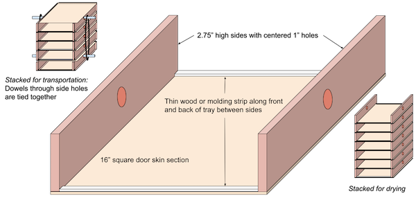
Click to see entire image.
The trays worked both for working on paintings and also for drying. They stack on top of each other with good airflow between them. Yet they protect against dripping onto paintings. Our paintings were all on pushpins so even if paint dripped onto a tray below the worst it could do is get paint on the pushpins.
The trays nest in pairs so they pack twice as tightly as they stack when drying.
The trays all have a hole in each side so I can put a dowel all the way through. I put one through the nested pair on top and one through the nested pair on the bottom. Then I can pull the two dowels together with a cord and carry the bundle as if it were a box. It prevents them from falling apart while being transported.
When stacked for drying it's important to keep them aligned. The shelves we used had a steel bar on the sides. The first stack was against this bar to help keep the trays aligned. The next stack was against the first stack. We worked across the shelf until we had four stacks.
People put their names on blue painter's tape with a sharpie, and attached the tape to their tray before they stacked it.
Looking Forward
I'm looking forward to teaching more classes on pour painting and offering other kinds of pour painting experiences for people.I would like to continue to offer classes through Ace Maker Space, but so far the classes were only a pilot and it is only half-way through that pilot. If there is a demand for the classes I don't see why they wouldn't continue.
But not everyone who wants a pour painting experience is willing to have that in Ace's workshops in Oakland. I think there is a market for having this kind of experience at someone's home, at an office or even as an activity booth in a larger event. It could be really fun at a birthday party as long as the kids can be trusted with permanent paint at your house.
Acrylic pour painting is a perfect example of finding beauty in chaos. It gently shows how the unexpected is not always bad. It gently shows how increasing control doesn't necessarily lead to better results.
You can't do this wrong and you can't do this right.
Underlying all the pour painting experiences is the idea that since you can just have fun painting: there isn't a right way to do it, nor a wrong way. People love to get into a creative zone and just make art. All the painting experiences support people getting into the flow in an accepting and kind atmosphere.
Making art together is a wonderful experience that brings people together. You can take your art home with you when it's dry in a couple days as a ready reminder that there can be beauty in chaos and you can affect but not control the outcome.
Skins
Origin Story
I love the patterns paint makes when it rolls off a painting onto the tray below. Sometimes I scrape the paint up carefully with a palette knife and lay it onto a painting, but it’s hard to transfer more than a tiny amount of paint onto a canvas, so that kind of beauty is usually lost in the process. It’s a gift from chaos to the artist but it’s a hard one to share with anyone else.I noticed that in a package of canvases a few of them will come shrink-wrapped. Perhaps every other one, probably because it means the rest don’t need to be wrapped as they are already surrounded by their neighbor’s plastic wrapping.
So I took one of the shrink-wrapped canvases and used it as a tray and painted a smaller canvas. Then I found that the dripped paint could be peeled off after it had dried. I found that it would stick to a glass door with no adhesive - just air pressure. That was about a year ago and I kinda forgot about it except that the two big drips I preserved have been stuck on my kitchen sliding door since then. They’ve never fallen off.
Recently I was wondering what I would do if someone wanted me to paint a wall of their home using pour painting techniques. How would I make a pour painting not on a canvas, but on a wall? To be clear, nobody has asked me to put art on their wall: it was just an interesting problem to solve in my head. I gave up on any approach involving putting wet paint on the wall because gravity is a merciless opponent. Then I remembered dripping paint on the shrink-wrapped canvases. I realized that I could probably arrange a flat space as big as the person’s wall, and cover it tightly in plastic sheeting, and then pour-paint onto the sheeting. Then after it dried I’d roll it up, sheeting and all and transport it to the person’s house. I’d unroll it from the ceiling down and separate it at the same time from it’s backing, while attaching it to the wall with a thick, but very slow adhesive. I’d work out bubbles and wrinkles as I went, but if done correctly these would be few.
That gave me the idea that I should just try producing painting-sized skins not on a canvas so they can be transferred to other surfaces. They can be mounted on glass and framed, or they can be shipped as a skin and someone can apply them to their own glass door or window for art that is beautiful and related yet different from both sides. Every painting presents a transformation and there is a definite “from” and “to” side.
Making Skins
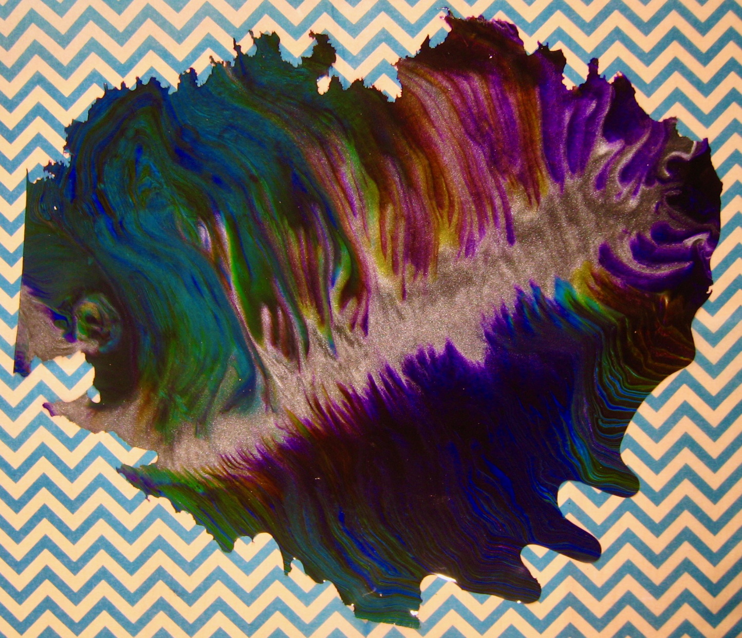
So I did some pour painting on some shrink-wrapped canvases and let the paint dry. I made several paintings of different types.Skins are more versatile than paintings, and twice as interesting.
One thing I imagined to be true is that the first color to hit the plastic at any point pretty much determines what the backside of the paint skin will look like. What you do with the paint will determine what the top side will look like. So, one of my paintings was a filled zone with black and graphite lines and various greens, yellows and blues in the zones. The back side is likely to look a lot like it did when I first put the paint down. The top evolved a lot. I didn’t do a swipe on this one because I really wanted to compare the bottom side with the highly evolved top. The difference is a transformation recorded in about 1/16” of paint.
In addition, I also made a swipe, a flip cup and a dirty pour.
I painted on 16x20 shrink-wrapped canvases.
The first thing I realized is that my goal was not to reach the edges and create a rectangular shape. My goal was in fact not to quite reach the edges so that the shape the painting took was completely natural. I didn’t always succeed. I can always cut a curve into a flat edge if I need to hide it.
This is the bottom of the skin, which would normally be adhered to a canvas:
This is the top of the same skin, if this was on a canvas this would be the only side you could see:
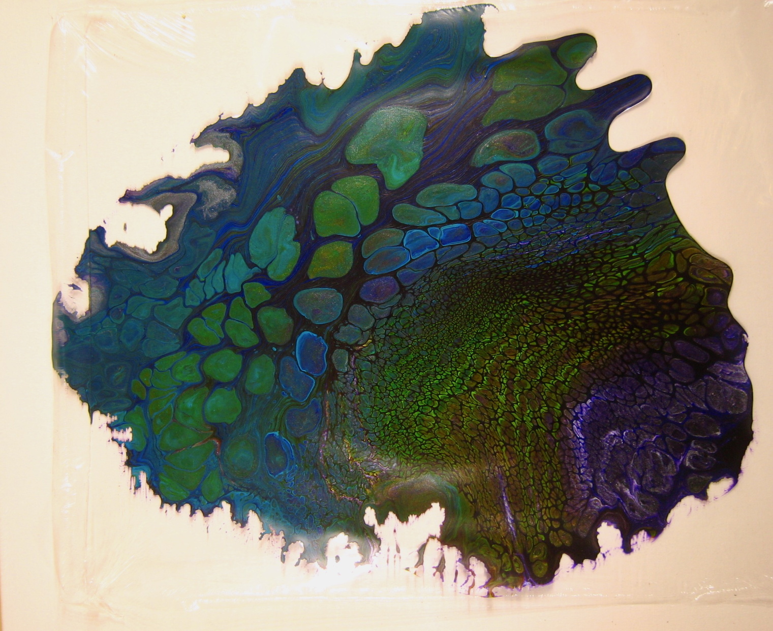
Most aspects of pour painting transfer well to making skins. I didn’t attempt to coat the entire work area with a color before pouring onto it. If I did that I think the back might just look like that base color since that is the first thing to touch it. I knew that techniques like panning a painting by tilting it would help spread the paint around the work area, but it wouldn’t affect what was seen on the back where the paint already was after the initial pour.
It is important not to make the paint too thin by panning too much. If there isn’t enough paint on the plastic sheeting the resulting skin can be difficult to remove and use. It’ll be more fragile. But, it might be more translucent, especially if you have used transparent or semi-transparent paints. One of my paintings wasn’t dry after 72 hours. That was a large filled zone painting. There was enough paint on it that the weight of the paint deformed the plastic slightly, leading to a much thicker middle of the skin than the edges. But, at least the paint didn’t roll off the edges.
You cannot use a torch to pop bubbles anywhere near the thin shrink-wrap plastic. It will immediately melt, which means paint may roll off its surface onto the canvas, gluing them together. It’s a mess and is easy to avoid. I pop bubbles with my finger or a dry toothpick or the point of a piece of paper.
Removing a Skin
I waited for 72 hours before attempting to remove the first skin from its shrink-wrap backing. It was completely done drying by then, but it wasn’t ready at 48 hours. One of them required five days to dry because the pain was very thick in the middle.I started by cutting the plastic wrapping around the outside edge of the canvas with a new blade on a hobby knife. It took almost no pressure to cut through the plastic and it never cut into the canvas. Then I carefully split the seam cut by the knife and removed the skin still on its plastic sheet.
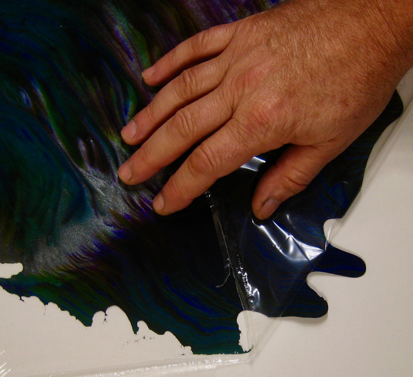
I put the skin down on a clean table and pulled the plastic back over the skin, keeping the rolling edge right at the level of the table. This pulls the plastic off without damaging the skin.
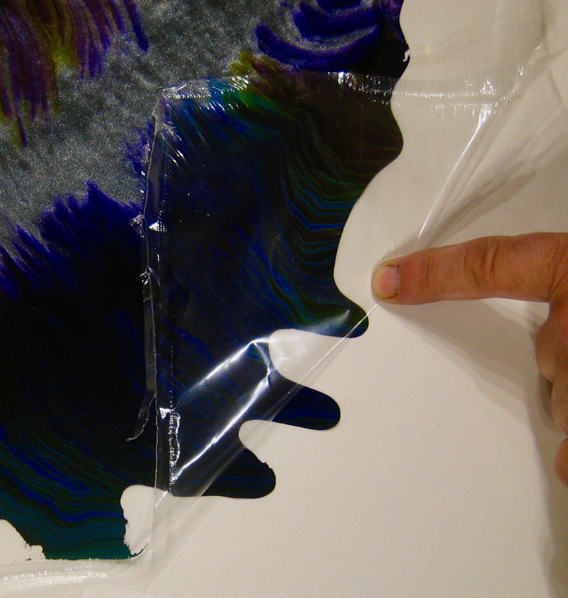
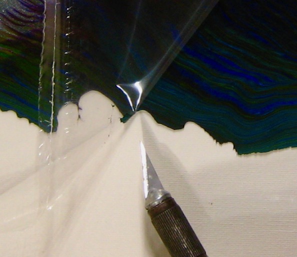
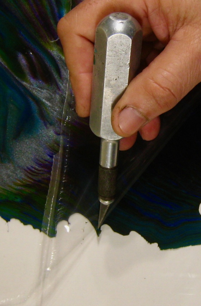
There were several points where I needed to use the hobby knife to gently separate the leading edge of a point of the painting to separate from the plastic, but once I separated them the plastic pulled off the skin quite easily.
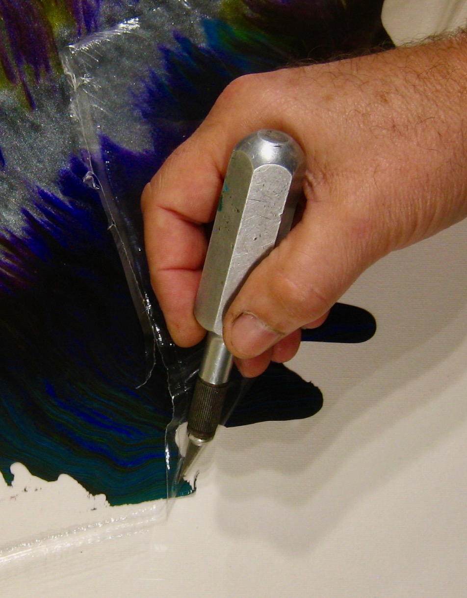
Wherever the painting had a contour that crossed the peeling edge I needed to get the orphaned edge separated from the plastic before I could continue the peeling process.
Even the finest details where the paint beaded up into fingerlings and deltas along the edge of the skin were preserved. It’s really extraordinary how many of the physical details of way the painting laid on the plastic were preserved.
Storage
Skins are fragile and are made of dried glue and acrylic paint. They have to be kept away from persistent moisture, but they can certainly be cleaned with a damp cloth and mild soap and water.I hold them by folding them inside a “book” I make using two sheets of cardboard that are the same size as each other, both being bigger than the skin. I hinge these two sheets of cardboard and fold a sheet of tissue paper inside the cardboard so it covers both sheets. I put the skin between the layers of tissue paper and close the book. I write Top and Bottom on the outside of the cardboard and I add my inventory number to the cardboard as well to minimize how often I need to open the book to look at it since its photo will be online.
Then I store the book flat where it won’t be bent or affected. Don’t put a lot of weight on the book or store it where it will get hot. I think if it is stored at a reasonable temperature and low humidity it will last a long time stored this way but I don’t have direct experience in long term storage yet.
Applications
Skins are really flexible and somewhat stretchy. They’re surprisingly strong but I wouldn’t push that. No doubt they will tear. They are easy to cut and to apply to a curved surface, even to a radius of a pencil. You can glue them on with white glue or rubber cement. It will adhere to glass and other highly smooth and clean surfaces without any kind of glue. Skins aren’t so durable as to be a good hand-grip though, but they can be coated with an acrylic sealer or even embedded in resin for a more durable results.Skins are pretty soft, so you can glue them on and then shave off the excess. Don’t worry about cutting them exactly to the shape of an object. Trimming off the excess after the glue dries yields a very clean edge that exactly follows whatever it was glued to. Clamping can be a challenge for some shapes. Rubber bands and weights work well for clamping, but remember that the glue can get on your clamps too.
It is easy to cut out shapes from of a skin and glue them onto cards, put them in photo albums as edges, borders, corners, separators or other embellishments. They feel like fruit-leather. Don’t install them where anyone would be tempted to taste them as they are still toxic if consumed. They are pretty inert once dried, unless swallowed.
You can also cut them along natural lines in the patterns on either the front or back, but they’ll rarely align so cuts like that will look better on one side than the other.
You can cut a large hole in the middle of a skin to form a framed area for a mirror. You can see yourself inside this frame. Use a compass to scribe a circle and carefully cut it using a hobby knife with a new blade on a tissue-on-cardboard covered surface. Careful not to cut all the way through the cardboard.
You can put it on a blank area of an appliance like a refrigerator or washer, or attach it to a cabinet door. A thin layer of rubber cement should allow it to remain on vertical wooden surfaces or any surfaces that aren’t smooth. A bathroom might be too wet, but corners on mirrors are easy to cut.
You can also cut these skins with scissors that have edge patterns. These come in a wide variety and are popular for scrapbooking.
To make four identical corners (e.g. for a mirror), fold a square piece of paper in half to form two triangles and cut them apart. Take one of the triangles and fold it in half and cut any pattern you like into the two separate (shorter) edges (not the two separate, longer hypotenuse). When you unfold the triangle the two sides of the pattern will be symmetrical. You can use this as a template to cut a skin to form four identical corner shapes which can be either glued to a mirror or simply applied to a clean mirror where it should just stick on its own.
Mixing and Blending Paint

I like to have a lot of colors on hand to use in my paintings. I mix paint by adding white glue and water to what comes out of the paint tube. I use the ratio of 1 part paint, 1.5 parts white glue and 1 part water. I use the word “mix” to mean combining the different kinds of things like paint, water and glue. I use the word “blend” to talk about combinations of colors. I blend colors before mixing the ingredients together to make a final quantity of ready-to-use paint.
To make new colors I like to blend different paints before adding glue. Some of my favorite colors are made by blending two colors in a 10:1 ratio. Usually I start with iridescent white or a light color like primary yellow and then add 1/10th or even 1/30th as much of the second color to the first color. I mix them together and then add white glue and water in proportion to the total weight of both of the colors blended together.
With iridescent white the colors look like glistening, fresh cotton candy.
With yellow I’ll add a light hue cadmium red and get a rich yellow that still isn’t orange, like an egg yolk.
With iridescent graphite I’ll add 1 part graphite to 5 or 10 parts of some other color.
I’ve found that a 10:1 ratio is a good place to start mixing colors. Whichever color is darker will need to be 1/10th the concentration of the lighter color. But, it can vary and sometimes it isn’t clear which color is going to take over when you blend them. If I don’t already have a good idea of how they will look when blended, I start by using tiny amounts of each using a toothpick or a scrap of paper to see how they respond with each other. I might try a 1:1 ratio and see which color it ends up looking like. It is funny how one color affects the other so strongly but not vice versa. If you mix primary yellow and Prussian blue as 10:1 respectively, you’ll get an amazing bright greenish yellowish color. If you reverse them you get Prussian blue that is slightly greened but mostly still very dark blue. The yellow barely influenced the blue, but the blue overwhelms the yellow. You can predict this after a while just by looking at the colors. Darkness prevails in the color wheel, but your choices will preserve the lightness.
I use primarily Liquitex Basics Acrylic paints which I buy online from Blick Art Materials. They come in a variety of sizes but often the 250ml size is the best bargain in terms of cost/ml of paint. Of course larger containers generally imply less plastic waste. And smaller containers might allow you to have a wider variety of colors. So, you have to choose what matters most to you when selecting the size you buy.
I use white glue, either Elmer’s White Glue or the Amazon Basics white glue. I use a lot of it so I buy it by the gallon. The consistency is consistent. That helps me get repeatable results when I mix paints at different times but use them in the same painting.
I use reverse osmosis water, which is like bottled water without the bottle. Indeed, some bottled water is just reverse osmosis filtered tap water. Other bottled water comes from springs. In any case, I try to use pure water. It probably doesn’t matter at all.
When I started mixing paints I used 2oz bottles, but I quickly learned that it wasn’t enough paint. So, I use mostly 4oz bottles, but I use 8oz bottles for the colors I use most: blacks, whites, gold and graphite. When I use 4oz bottles I usually mix one ounce of paint with 1.5 ounces of glue and one ounce of water, which adds up to 3.5oz of finished, mixed paint. That fits nicely into a 4oz bottle. I refill the bottles when there’s about 1/2 ounce left or less.
If you blend your own colors, write the formula on the bottles. Include the names of the colors and their ratio. If they rub off the bottle you can cover the writing with clear packing tape.
I currently have over 80 colors mixed and ready to use. It certainly isn’t necessary to have that many colors. But, I like to make paintings with a lot of colors in them. What I call a “filled zone” painting can have 20-30 colors in it. I also make paintings with only just a few colors. For example, I might cover the canvas with back and then put two colors into a cup alternating with each other and make a dirty pour painting with that cup. The whole painting might have only three colors in it.
When blending colors I think about the color wheel and the relationship between the colors. I wrote about how I think about the color space in a blog posting called Traveling in Colorspace.
I like having a whole set of 10:1 iridescent white + other colors. This works with almost any color, so however many tubes of different colored paint I have are how many colors could potentially be in my light iridescent paint set. But, I only have about a dozen of my colors mixed that way. Colors can start to look too similar when they are lightened up 10:1 with white. I have several based on primary yellow, using 10:1 or 30:1 ratios with some other color. ,And I have a few colors that I darken with iridescent graphite. But when using a dark color like graphite it ends up being 1 part and the other color ends up being 10 parts (or sometimes 5 parts depending on how dark I want the result).
I’ve experimented with mixing fluorescent paints together and the effect is not what I expected at all. If you bend two colors of fluorescent acrylic paint the result looks different under white light vs. under black light. The white light color is probably about what you’d expect. The black light seldom is. It’s kind of fun and worth exploring if you like making black-light sensitive paintings. But, I wasn’t too happy with some of them. I did like the 1:1 blue/green combination and the 1:1 yellow/green combination. Blending fluorescent and non-fluorescent paints generally doesn’t work as planned. It has the effect of terribly dimming the fluorescent paint under blacklight. The white light illuminated blend will look nothing like the black light illuminated blend.
I’m pretty careful with the ratio of paint to glue to water, but in the end I am looking for some chaos. My paints do not all have identical consistency. A little too much water matters a lot. A little more or less paint probably not so much. I used to start a pour painting by covering the entire canvas with a thinned coat of some color. To thin the paint I’d mix in a little water right before applying it to the canvas. I don’t usually do that anymore because it can have a big effect on how the painting evolves. I do sometimes add pure water on top of a painting, which I wrote about in my Waterworks blog post.
I like to mix paint ahead of time, when I’m too tired to do anything else. When I do have time to paint I can dive right in and begin painting. When I have the time and energy to paint, that’s exactly when I don’t want to sit down and mix a lot of paint.
One of the reasons I like to have a lot of colors is so that I can choose a set of related colors for a painting. If I want a lot of purples I can choose from light ones and dark ones and iridescent ones. But, I only have two different tubes of purple paint. I got those other colors through blending. if I start with Prism Violet I can add various ratios of iridescent white or iridescent graphite to make an entire family of different lightnesses of Prism Violet. They work together by sharing a common position on the color wheel. Juxtaposing this family with a contrasting color creates a mesh of color relationships that is much more complex and interesting (to me) than two contrasting colors next to each other.
Another reasons I like to have a lot of colors is that I can combine similarly blended colors and they fit together nicely. For example, all of the 10:1 iridescent white + some other color blends have a similarity to each other. They have similar lightness levels even though they are in various positions around the color wheel. They’re siblings. They work well together.
Finally, some paints are opaque, some are semi-transparent and some are transparent. A transparent color is like a stain that you can see through to the colors below. Imaging looking through a lighting gel or a colors but clear piece of plastic. Like looking through rose colored glasses everything is shifted toward that color on the color wheel. But, it doesn’t become that color, it just moves toward it sort of the way colors blend to form a new color that isn’t either of the original colors.
You can tell how opaque paint is by looking for a small square on the paint container near where the color name is. If the square is filled in, it is an opaque color. If it is half filled it is semi-transparent. If the square is empty (just a border) then it is transparent.
You can of course blend any colors you want together, but opacity is like darkness - it takes over. A 1:1 blend of opaque paint to transparent paint will end up being pretty opaque. Two transparent paints blended together will remain transparent. I really don’t worry about this much when blending paints - I’m mostly concerned with getting the color I want.
Where opacity matters most is where transparent colors are on top of other colors. In the kinds of paintings I make using pours and swipes the paints are dragged or flow over each other forming many layers of different colors. If I put a transparent color on top the colors below will be slightly visible. If I put an opaque color on top they won’t. I tried mixing in mica powder into opaque paint and it completely disappeared! That doesn’t happen in transparent paint. I found that transparent paints don’t retain their brightness when they dry as well as opaque paints. As a consequence, I don’t pick many transparent colors.
Whatever colors you choose and however you blend them, they’ll become your palette for painting. They’ll reflect your values and preferences. There are an infinite number of colors, so picking 5 or 10 or 20 or 100 is still a tiny drop in the bucket of how many colors there are. Sometimes adding some new colors to your palette can open up some new ideas for you or lead you in a direction you didn’t expect. It’s one thing to add a few squirts of turquoise to a cup and then pour. It’s quite another to cover the entire canvas in turquoise before pouring. Sometimes starting with a new color will make you see the others in a new light.
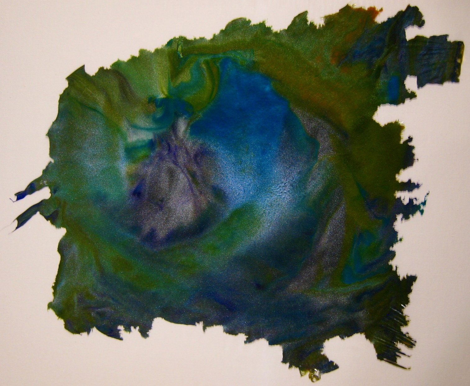
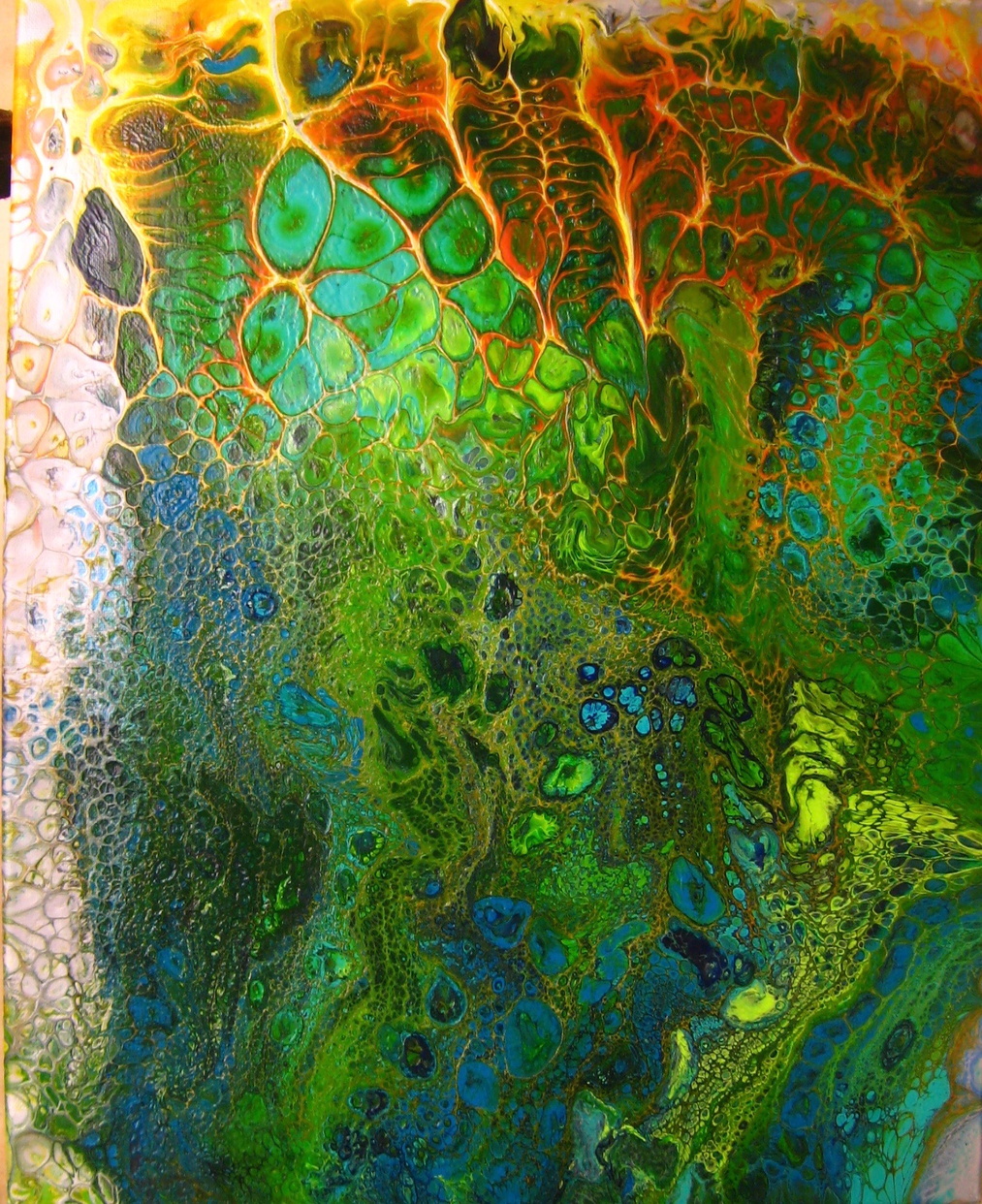
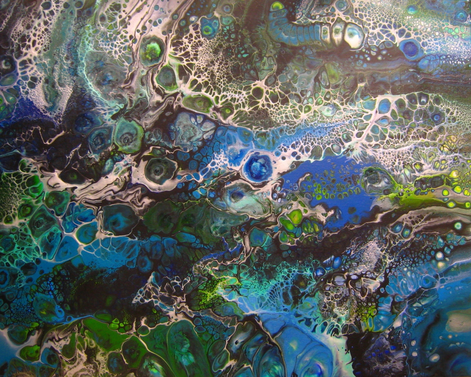
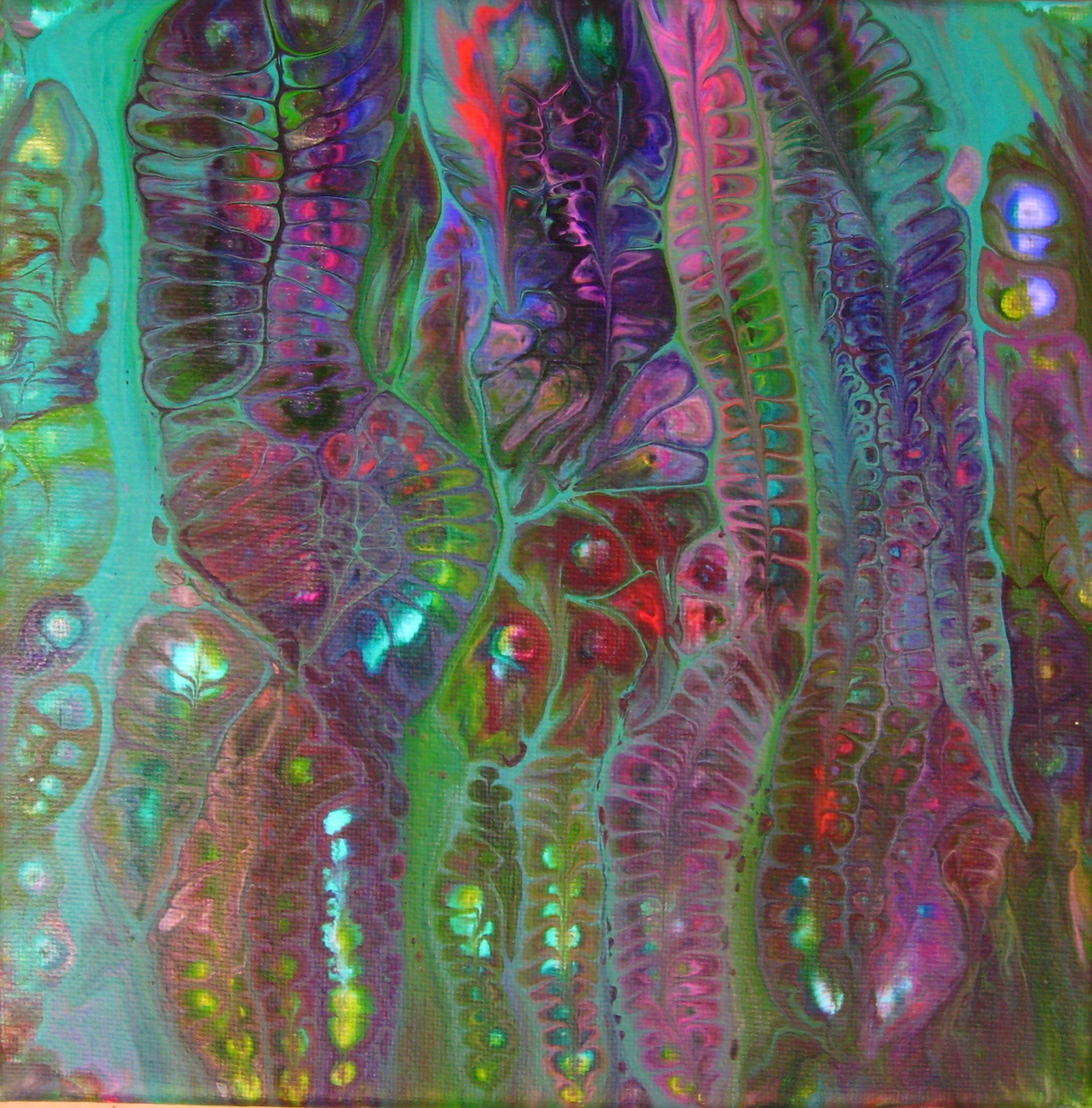
Filled Zones
I start with an empty canvas.
I choose one or a small number of typically darker colors, or black, and I squirt lines randomly all over the canvas. I try to get close to all the edges. I keep adding curved and looping lines over the canvas until it has been divided into irregular shapes about 1 to 3 square inches in area each. I don’t want squares, of course. I want weird shapes. These are the zones in the filled zone technique. More zones means fewer opportunities to place colors, which is neither good nor bad in itself. It is merely under your control. Lots of tiny zones takes a long time to fill. Too few zones and you’re probably doing what might be called a clean pour.
To fill the zones I choose a palette of colors I think will look good together. I like using a lot of colors. I squirt them inside the zones with enough paint to touch at least one of the dark lines that define the zone. When there is enough paint surface tension spreads the contact point until the paint fills the entire zone. Sometimes I go back and add more paint if it didn’t seal itself against the edges of the zone.
I squirt what I think is enough paint into one zone, and then the same color in other zones some distance away. I usually want to separate where the same color appears on the canvas. Two adjacent zones with the same color is just like a bigger zone of that one color. Sometimes I’ll put all the blues toward one side and the greens toward the other, for example. Any pattern is fine, of course. Sometimes I’ll put more than one color into the same zone because why not?
When I’m done filling all of the zones I usually add paint along the outside edges, so the entire canvas is covered. This is especially important if the next steps will include a swipe.
This is the point at which I make sure that all of the sides of the painting (the vertical edges of the canvas) are covered with paint as well. I always cover the edges on my paintings, but you don’t need to if you don’t want to.
I usually will use a swipe after filling all the zones and adding paint around the edges. I like using colors from far away on the color wheel when choosing the color to swipe over all the paint already on the canvas. For example, if I laid down blues and greens I might swipe with orange or red. And, of course, you can always swipe with black or white or any kind of gray. I add whatever swipe colors I want along the starting edge for the swipe.
I lay down the swipe color all along one edge, in lines one after another usually. But, really, any pattern will do as long as you add more paint. It needs to sweep over the top of the cells. I might add the thickets layers of paint possible for about 10-15% of the canvas on one side and then swipe that pile across the whole painting.
I use a piece of laminated poster to swipe over the painting. I found that a laminated poster can be cut Into widths suitable for different sized canvases. Mine had a natural curve from when it was stored in a tube. I cut a piece about 8” long and it formed a curve with a radius similar to a soccer ball.
I drag the curved piece of laminated poster across the paint, ensuring that I have good contact along the entire width of the canvas. I usually try to swipe all the way to the other side of the painting. If you run out of paint and the swipe runs dry it sometimes looks good too, so don’t fret if that happens. It probably means you needed more paint along the starting edge before you began the swipe.
Once I’ve completed the swipe I try not to hold the plastic sheet across the painting again because it will drip. I’ve tried dripping it on areas with too little paint, but I prefer to use enough paint because I think the results are better. You can add more paint, for example by swiping from the other direction and stopping in the middle. I might add a bunch of new swipe colors on the side the original swipe didn’t reach. Swiping back toward the middle from second side can yield really nice results! But stopping in the middle without dripping can be a challenge.
After the swipe or swipes are done I look at the painting and decide what kind of cells I might want to create, if any.
If I want to stimulate cells I take the tip of a pointy palette knife and wet it with a tiny amount of pure silicon oil. Much less than a drop. Then I touch the point to the painting wherever I want. I look for places where there are many layers of color on top of each other. Those make the best looking cells. If I touch the painting near to another cell both cells will find each other. If I touch a lot of places in the same area it takes on a biological look because all the cell walls touch each other and look like a cross section microphotograph of some kind of living thing. If I touch the painting far from other cells the cells can grow to a large size depending on how much paint is there and how viscous it is.
I also like to spray tiny droplets of silicon oil onto the painting using a toothbrush. I put a drop of oil on the toothbrush and use my thumb dragged across the bristles to send tiny droplets flying in all directions. When I don’t want the spray in all directions I control it by holding a piece of paper close to the painting, blocking where I don’t want the spray to go. It is really difficult to control this kind of spray. If you are painting with others you will probably hit their paintings if they are within a few feet. But, the results can be stunning, looking like a spider web or sponge or less zoomed in photomicrograph of some living thing.
The advantages of the filled zone technique include:
- Automatic scaling of the amount of paint to the size of the canvas
- Leads to many layers of colors, which leads to fabulous cells
- Lets you control color distribution before any panning takes place
- Limits or eliminates color mixing until you swipe or pan
- You retain control of the first color to stain the canvas
Of these, the first is one of the most important to me. I had a hard time knowing how much paint to use with other techniques like the flip cup and dirty pour. When working on larger canvases I had problems: I’d use too much or too little paint.
Too little paint rarely looks good in my experience. If the painting needs more paint, I add more paint somehow.
Too much paint is a waste at best. At worst, your lovely painting slides off the canvas onto whatever shelf it is drying on. Even if the shelf is exactly level (is yours?), too much paint will mean it slides off all the sides of the painting, not just one side. You might end up with a masterpiece. Or you might wonder what happened to the painting you put there last night. The more viscous the paint the thicker it can be; however, at the viscosity I use I find that I really don’t want too much paint on there and the filled zone technique helps me avoid that.
The second advantage is lots of layered colors. When you swipe over a filled zone painting the colors overlap as the ones on one side end up on top of all the colors further along in the swipe. While at the beginning it is only the swipe color(s) over the underlying zone color, once the swipe reaches the next zone the swipe colors cover two zone colors. As the swipe reaches each zone the swipe colors cover one more and one more color, and so on toward the other end of the canvas, until you run out of zones. Multiple swipe colors on top help ensure that even the first part of the painting has several layers. But, the cells might be better closer to the middle and the end of the swipe where there are going to be more layers.
The rest of the advantages are all about retaining control of the paint. Of course, I want chaos in my paintings - that’s why I use one or two swipes after laying out the paint in filled zones. But I want to choose when the chaos begins.
If I use a cup technique like a dirty pour, kiss pour or flip cup then when I work on a larger canvas I want to use enough paint to cover it. The colors mix and interact a lot before they cover the whole canvas, and I’ll have to pan the painting to get the paint near the edges and corners. I sometimes coat a canvas with paint first so that the cup pour doesn’t need to reach the edges or corners. I like negative space. But, if I want the paint to reach the corners I have to use a lot of paint and pan it around or use another technique to help the paint reach the entire canvas. By the time that happens, the colors have mixed or interacted a lot.
By comparison, you retain control of the colors for much longer through the process of covering the canvas. In fact, if the background lines are thick enough the colors in different zones won’t mix at all. But, they might mix with the background lines themselves, which is a nice effect sometimes.
You can do a lot of different things after using the filled zone technique. For example:
- A swipe from one or two directions
- A circular swipe
- Pan to shift and mix colors
- Blow on the paint with a straw or hair dryer, as with a dutch pour
- Use balloons (or those air pillows they use instead of packing peanuts when shipping packages) and press them onto the painting and then remove them
- Do nothing at all and let the painting proceed on its on
Links:
Filled Zone Gallery at Captured Chaos Art
This painting:
This painting:
This painting:
Waterworks

The water dripped onto the colored portion and thinned the paint. The black background was already wet black paint and the water spread out over it carrying the thinned colors along with it. I found that it worked better with dark colors of light ones, but that the effect was difficult to control and didn’t always even happen. I tried the same approach in many locations but it might only form a delta shape in one of them.
I wanted to understand more. I tried a bunch of different liquids aside from water: alcohol, dish soap, silicon oil, mineral oil, and hydrogen peroxide. The hydrogen peroxide worked like water and nothing else did. The others form cells, but the water does something different.
I started experimenting with water and with watery paint. I found that pure water on a painting can be interesting but once you begin to apply water you can no longer tilt the painting and use gravity to pull paint around. This tends to push steps involving water or watery paint toward the end of the process for a given painting.
The problems with water were that if too much was used it could cause the paints to blend or it might flow underneath the paint where it doesn’t have as much of a visual effect. It does have an effect, but if it doesn’t change what the painting looks like very much it isn’t that interesting to me.
In the photo below all the paints were mixed 50/50 with water and the background Prussian blue over a bunch of colors distributed around the canvas. Water was dripped on the canvas from various heights (with no paint in the water). The height diminishes from left to right, from about 3’ to about 1/2”.


C) The water drips in this area and the area above it were dropped from about three feet.
D) The water drips in this region were dropped from about two feet.
E) The water drips in this region were dropped from about one foot.
F) The water drips in this region were dropped from less than an inch.
What I found was much more interesting was thinned paint, used as water. I experimented with lots of different concentrations of thinned paint. I finally settled on a 50/50 mix of prepared pouring paint and water. I use a recipe of 1 part Liquitex Basics Acrylic Paint, 1.5 parts white glue and 1 part water when I mix my paints. The result is something very like water but with enough color to be seen on your painting.
Here is a practice canvas covered initially with iridescent white. I dripped thinned paint of various concentrations on it from various heights.


K) The yellow was thinned too much. I tried a 10:1 mix of water to mixed paint and it disappeared into the background. Perhaps a darker color would work better but even the darker colors faded out at lower concentrations. They look better when wet than when they dry when the concentration of paint is low.
L) this is a drip of red, thinned paint that was dropped from very close to the canvas. I was hoping it would form a delta, and it has the beginnings of that, but most of the thinned paint slipped beneath the background white color. You can see lots of other dots that have slipped below the surface and not interacted with the paint around them.
M) This one was dropped from about a yard above the painting. When it hit the paint exploded and you can see lines and dots of paint around it where small bits of paint went flying. Some slipped below but because there was so much force when it landed, it didn’t have a smooth edge. The smooth edge is an impediment to forming details like a delta. Where will the effect begin? No one spot is favored over any other and nothing breaks the tie. Whereas, with the chaos of exploding on the canvas there are lots of differences along the edges and some of the paint flows out and some doesn’t.
N) Smaller amounts of paint dropped from heigh enough record an impression of their explosive pattern. If the paint ends up thin enough it dries fairly quickly and that halts any kind of evolution involving the water.
O) Larger amounts of water, such as consecutive drops in the same place can interact and support each other.
P) When there is too much water the paint can blend (as if you were mixing colors). If the canvas isn’t completely flat too much water will find an edge and carry paint with it.
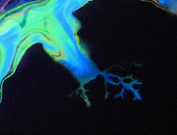
I put it all together and began working with larger amounts of paint dropped from high positions. Here’s a portion of a canvas where I dropped lots of dark purple paint drops in about the same area and let them all interact. I also dropped lighter purple drops of paint, but less of them overall. It may also have been that the light green background had begun to dry by the time the lighter purple drops were applied.


A) This area shows what I think was a single drop of purple paint from among a bunch of drops of paint that fill the upper-left portion of this image. They formed deltas all around them. I made more of the purple paint so its mixture was probably closest to 50/50.
B) The lighter purple drops yielded poor results. Either the canvas was too dry, or the concentration was off, or there was too little water. The area with B and the just to the upper left of it are among the best results with that color, but lots more dots did nothing at all. To be fair, the light green background was a thin coating on the canvas and not a thick coating of paint. I did experiment separately with dropping thinned paint onto a painting with a thicker coat of paint, and the drops slid under the paint and mostly disappeared.